 Mikayla's Art & Multimedia
Mikayla's Art & Multimedia
Mikayla's Art & Multimedia
12/11/2020
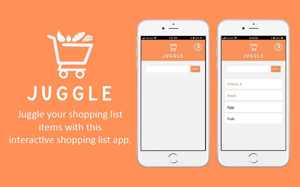
Juggle is a shopping list application for IOS devices that allows users to add their shopping list items, mark them as completed, and delete their items. Over the course of 11 weeks, I developed Juggle using jQuery for main functionality and cache manifest to store the user’s data.
From my research into various shopping list apps, I noticed many of these shopping list apps have complex designs in which information is stored. My goal in creating Juggle was to achieve creating a shopping list application that resembles a list/notepad and contains a simplified design that is easy for users to interact with. The problem was designing a simplified shopping list app that would be easy for users to understand how to use. To develop this application, I used html, css, javascript, jquery, and cache manifest to make this app work.
The first assignment is what gave me inspiration for creating this web app. I was given the task to create the “face” of my web application using portrait to landscape media queries. For this, I created a simple interface that interacts with portrait to landscape orientation. In portrait mode, you can see a shopping cart filled with various food items with the title of the app and slogan below. When the phone is flipped to landscape mode, the shopping cart is tilted showing the food items scattered with a message below prompting the user to turn the phone back to portrait mode. You can view the results here:
The interface for this assignment gave me the inspiration for the overall design of my web app. During the development process, I implemented the app’s logo and name into the “Add To Home” feature in Safari’s web settings to instruct the user to add the application to the user’s home screen using JavaScript.


While designing the layout of Juggle, I ran into some usability issues. Before my final design, I displayed the add and delete buttons above the input box, but when users tested the app, they were unsure how to add task items. Users also commented on the styling of a selected task item, saying it was hard to read.

In the 2.0 version of Juggle, I ran into an issue with the status bar making the content “black-translucent”. My purpose in making the status bar translucent is so that the status bar content would be readable as shown in the left image, but I did not take in account that this would be affected by the modal I had added in the right image.
In this version, I added a help modal as shown in the top right hand corner of the app (the question mark), in hopes that this would guide the users on how to interact with the app. I also moved the add and delete buttons below the input box as well as altered the styling of a selected item so that it is easier to read.
I still received mixed feedback after these adjustments. Users did not like the layout of the buttons and found it hard to go between crossing out an item and editing an item. Users seemed to be more focused on crossing out an item after it is added to the list then editing an item. Users also did not like that they needed to individually select an item before tapping delete each time.


For my final design, I made adjustments based on my user’s feedback from the previous version of this app. In this version, I got rid of the delete button and implemented it into the items when they are selected, moved the add button to the right of the input box so that it would give users the incentive that text can be added, removed the edit feature since it conflicted with users wanting to cross out an item, and added cache manifest to save the user’s added list items.


I believe developing this app was successful. My intended goal in developing Juggle was to create a shopping list app that is simple and concise, therefore I don’t see myself adding more functionality to the app. If anything, I would like to improve the css animations implemented in the app and design.