 Mikayla's Art & Multimedia
Mikayla's Art & Multimedia
Mikayla's Art & Multimedia
8/29/2020
Over the course of eleven weeks, a team of six designers and developers worked on designing and implementing the redesign of the Amazon Prime Video App. This project adopted an iterative process, where we held three phases of usability testing and made necessary design changes in response to our findings. Through the testing, we received insightful and valuable feedback that contributed to enhancing the “Creating a New Profile” task flow, particularly the personalization process that now has five more pages in comparison to the Alpha state. The app is a fully coded web page using HTML, CSS, JavaScript, PHP and MySQL.
Prime Video is a video streaming service available for Amazon Prime members. It offers thousands of Prime titles for free, with the option to rent or buy movies and TV episodes not included with Prime Video.
The Problem: For our class, we were given the project of redesigning and implementing a functioning web-based app of the Prime Video app based on a previous redesign on Figma. Our task was to carry on with the redesign and make it functional with code and a database. The critical path we chose to focus on starts from the “Adding A New Profile” page until the “Home” page.
Goal: To design with usability testing a satisfactory user experience “Adding a New Profile” leading up to an intuitive “For You” homepage that is fully functional and dynamic with HTML, CSS, Javascript, PHP, and MySQL as a web-based app.
Purpose: To learn how to work in teams collaboratively and efficiently with management tools, and fully utilize all the skills we have learnt so far to successfully build this web-based app.
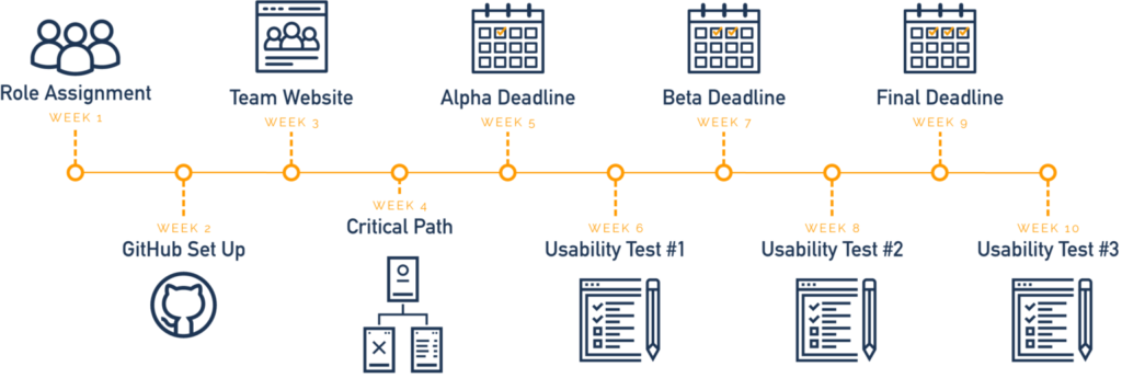
Timeline: The project spanned over 11 weeks with a strict timeline structure as outlined below.

I worked as a primary frontend developer and secondary data architect for this project. As a frontend developer, I communicated with the UI/UX designers to implement designs in hard code and make sure functionalities such as inputs, buttons, cursor events, and responsiveness worked in our web application. As a data architect, my job was to organize files and gather data for our backend developers to create a database for our application. I enjoyed my role more as a frontend developer for being able to work with UI/UX designers, sharing and receiving feedback from the designers based on user surveys to implement changes.
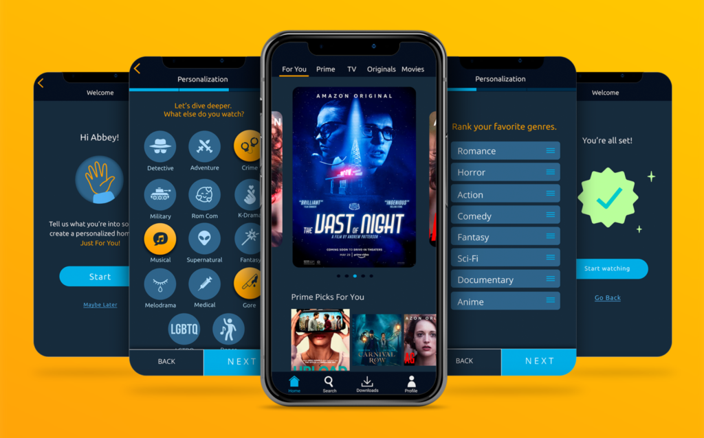
In our team project, our critical path focused on the personalization process of the application. Our final result included a total of 9 screens including the home page.

I started creating the genre ranking micro interaction in the beginning of this project. The challenge was to get the user to be able to drag and drop a list of movie/show genres in their favorite order. I used jQuery scripts to get the drag and drop function to work. For the layout, I created a div to contain the numbers and a ul list for the sortable items and applied a flex box to the container div for both elements called “rankings” to align together. For the script, I added the ul id for the sortable items “#sortable” to the function to make each of the items dragable by adding “cursor: grab” to the sortable list in css.


In our personalization process, our team wanted to give the user the ability to enter their name in a textbox that would validate the name before proceeding with the next screens. To start, I created a form with some placeholder text. To make sure the input required the user to enter their name before clicking “NEXT” I added “pattern=”^[a-zA-Z]{1,20}$” required in the span class “notvalid” to make sure the user is only putting in their first name and not including any spaces or numbers in their submission.

The span class “notvalid” visibly tells the user to enter their first name. By adding a removeClass and addClass function to the jQuery script, the script is replacing the “notvalid” class with an “isvalid” class that will show a checkmark to indicate that the name the user entered in the input is valid and the user can then proceed with the next page.


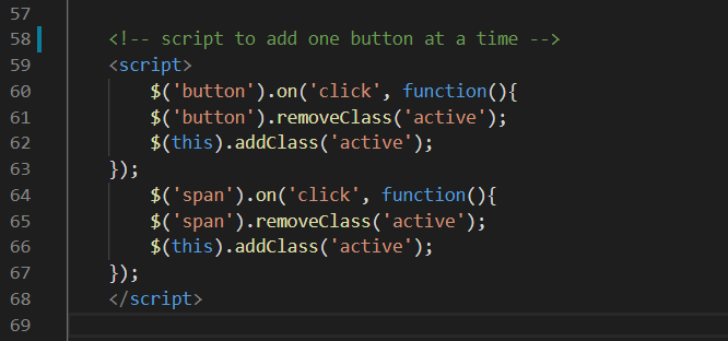
The age page asks the user what age range they fall in with a checklist of age group options. When the user clicks on an option, the option is checked with a filled circle and the background of the button changes to a light blue color with a back shadow. If the user clicks another the option, the previous selected option will deselect automatically. For this micro interaction, I used a jQuery script to remove and add a class on the active button so that the button with the active css will apply when the user selects one of the options.

In our personalization process, our team included two screens where the user can select their cultural preferences. The sub genre page is a designated page for movie/show categories such as Crime and Fantasy. The cultural page includes movie/show categories related to regional areas such as Spanish or Chinese.


For these micro interactions I used the same script but modified the script to toggle between classes instead of adding and removing classes, similar to the one that was used for the Age Range Micro interaction, except the purpose of both these micro interactions is to allow the user to select more then one option presented on the screen.


For the Sub Genre page, The buttons which goes by the “button” class is being called to toggle the active state each time it is clicked which changes the background color and adds a back shadow every time the button is clicked. The same script is applied to the Cultural page, except every time the button is clicked, there is a slight orange transparent overlay.
Unlike the script for the Cultural page, there are two child elements that are also being toggled between their regular and active state in the Sub Genre script, “.subiconshow” and “.subgenreicon”. Both child elements are svgs, except “.subgenreicon” is the light version of the icon that shows on page load and “.subiconshow” is the dark version of the icon that is kept hidden by “display: none” before the script becomes active. When the script is active, the classes toggle back and forth between “display: none” and “display: show” so that the correct icon is visible when the button is either clicked or unselected.

The Featured Slider micro interaction shows the top most featured movies on the Prime Video app which contains 5 thumbnails in our redesign. The micro interaction shows the focus image in the middle with the previous and next images peaking to the right and left of the focus image. The goal is to get the user to scroll threw the slider to see the next or previous containing image. If the user scrolls to the left or right, the next or previous thumbnail image will slide in place of the focus image and the previous or next focus image will slide off screen.
Along with the slider, the pagination corresponds with which slide the user is on by highlighting a blue circle out of the five visible circles shown below the slider.
I started by wrapping the images in a “swiper-slide” div contained by 3 more divs, “swiper-wrapper”, “swiper-container”, and “main”. The main container is to keep all of the child elements in place, the swiper-container defines the height and adds padding between the slider and the pagination, the wrapper aligns the images in the center, and the slide defines the width and height of the images.

The script allows the container to move between slides using a couple rules to define the slider. “SlidesPerView” is set to auto so that one slide is displayed along with “centeredSlides: true”. The “spaceBetween” rule allows a certain amount of space between the next and previous images so that the images can still be seen to the left and right of the focus image. The loop allows the slider to continuously swipe with “grabCursor: true” allowing the user to swipe threw the slider. The transition between the previous/next image and the focus image becoming larger when it is scrolled to the center is applied to the active state of the swiper-slide by using “transoform: scale(1.2); transition: .4s;”.
The “swiper-pagination” being set to “clickable: true” enables the pagination to correspond with the slide that is being viewed on the slider.


The Progress Bar micro interaction was a last minute step our team wanted to add into our final redesign. The micro interaction is incorporated into 3 of our personalization pages; the genre ranking page, the sub genre page, and the cultural preferences page. The micro interaction tracks the progress of the user across the 3 screens. The micro interaction starts off as an empty bar until the page load triggers the bar to fill up a quarter of the way on the first screen. When the user continues to the second screen, the page load triggers the bar to fill up half way across the screen. When the user gets to the third final personalization screen, the page load triggers the bar to fill up completely, indicating that the user has completed the three progress step screens.

For the code, I added a parent and child div (“progress-wrap” and “progress-bar”) but both have a secondary class of “progress”. The “data-progress-percent” corresponds with the jQuery script that initializes the progress bar to move when the page loads.

The first lines of the “moveProgressBar();” function load the micro interaction when the page is loaded with “$(window).resize(function() { moveProgressBar();”. The rest of the progress script defines what percentage of the bar gets filled, calculates the width of the progress bar, and how long the animation lasts for. The script is the same on each of the 3 screens, except the “data-progress-percent” number is changed in the div to show different progress on all 3 screens. No matter if the user decides to go back or forward a screen, the micro interaction will always show the user the correct progress percentage.
Our implementation of the Amazon Prime App was an overall success. We were able to code out the mobile based app, including micro-interactions, front-end, and back-end coding. The critical path that we chose was fully implemented, and we added some new redesigns into the critical path as well. Each of our team members did their part to reach our team goals in finalizing our design. This was my first team project working as a primary front end coder. In the beginning, I felt my coding skills were not very strong but towards the end of this project, I think this project taught me more about the frontend coding aspect as well as working as a team. I enjoyed my role as a primary frontend coder for being able to be involved and communicate with the UI/UX designers, incorporate their designs, and get feedback.